
Flexbox Exercise
(Week 6, Tuesday 10/2)
The "Holy Grail" layout has traditionally been considered one of the most challenging problems for web designers. That changed with the introduction of Flexbox in the CSS standard. (And changed even more with grid, which we'll look at on Thursday.) In today's exercise, you'll use Flexbox CSS to create a three-column layout with equal-height columns and a footer that never is higher than the bottom of the viewport, regardless of the amount of content in the columns.
Due: By start of class on Thursday, 10/4.
Flexbox Froggy
Before you start on the exercise, spend some time with the Flexbox Froggy game, which will give you a solid introduction to flexbox container and item properties. Once you're comfortable with those, move on to the exercise.
(There's also a tower-defense game called Flexbox Defense. Flexbox Froggy is a little better for getting up to speed quickly, though.)
Setting Up the HTML
Create a folder for this exercise in your igme230 repository. Download the following HTML files into that folder (right click on the link and choose "save file as"):
The HTML file has the structure and content of the document, and you won't be editing it at all--but you should open it and make sure you understand how it's structured. You should also open it in a browser so that you see what the default layout looks like before we begin.
The CSS file is where you'll be doing your work for this exercise. I've started you off with some basic formatting, so that you can easily see how the document is structured. You'll be adding your CSS rules to what's already there.
Setting Up the Containers
Flexbox controls the layout of a single line of items, so we're going to need two nested flexbox containers. The wrapper div will be a flex container for the header, footer, and main elements. The main element will be a flex container for the article, nav, and aside elements.
In your CSS file, assign display: flex; to both #wrapper and main.
The wrapper should use a column-based flex layout (flex-direction: column;) so that the three elements stack, while main should use a row-based layout (flex-direction: row;) to place the content elements side-by-side.
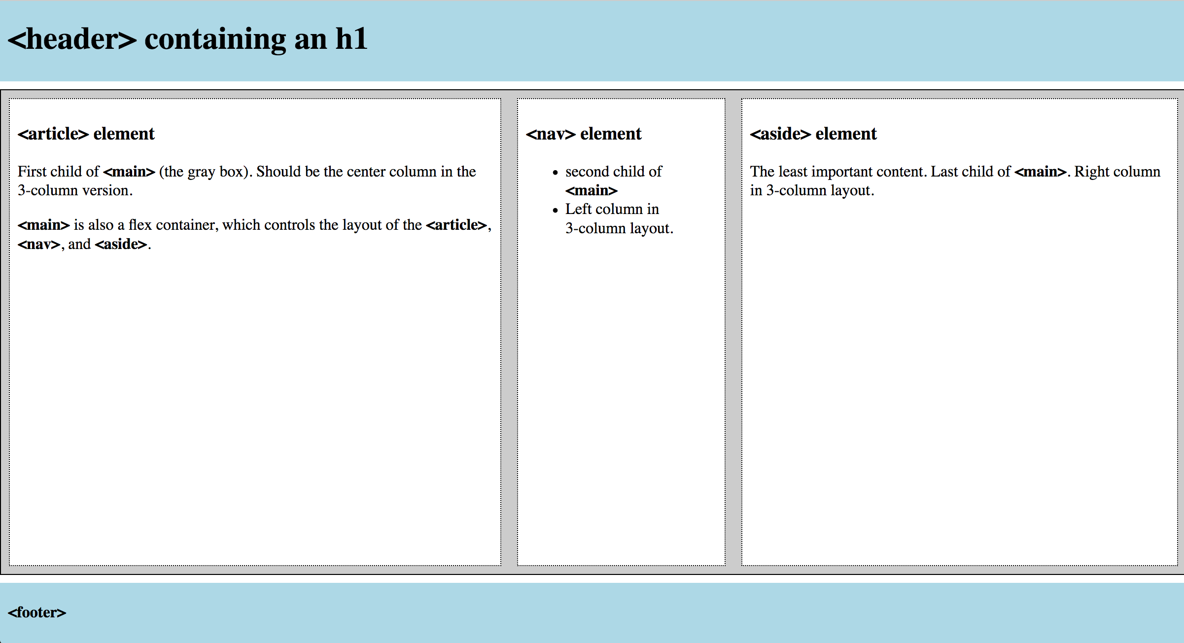
Preview the HTML file now. It should look like this:
Note that if your browser window is wider than mine (which is likely, since I use a small laptop), your columns may not fill up the window horizontally as shown in that screenshot. Here's how it looks if I zoom out:
Filling the Window
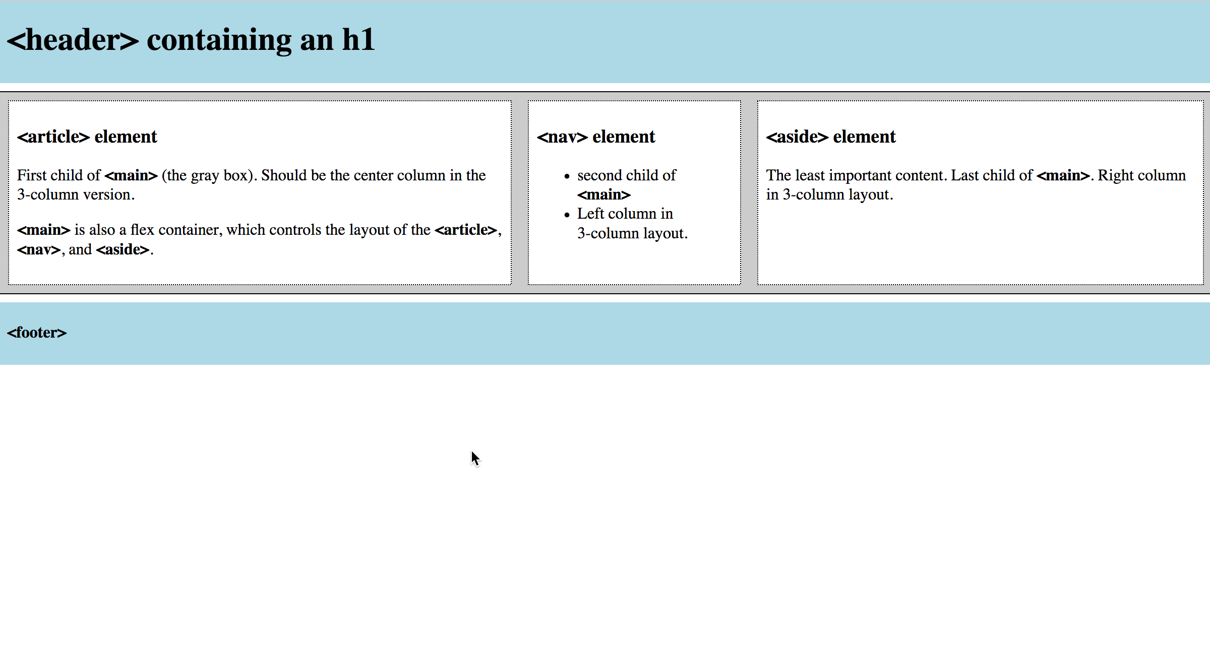
Because the default value for align-items (vertical alignment for a row-based flex container) is stretch, all three of the columns in the main container have stretched vertically to the full size of <main> (the gray box). But they're only as large as the tallest column, because <main>'s height is determined by its contents.
To force the footer to the bottom of the page when the columns are short, set #wrapper to fill the full viewport height: min-height: 100vh;
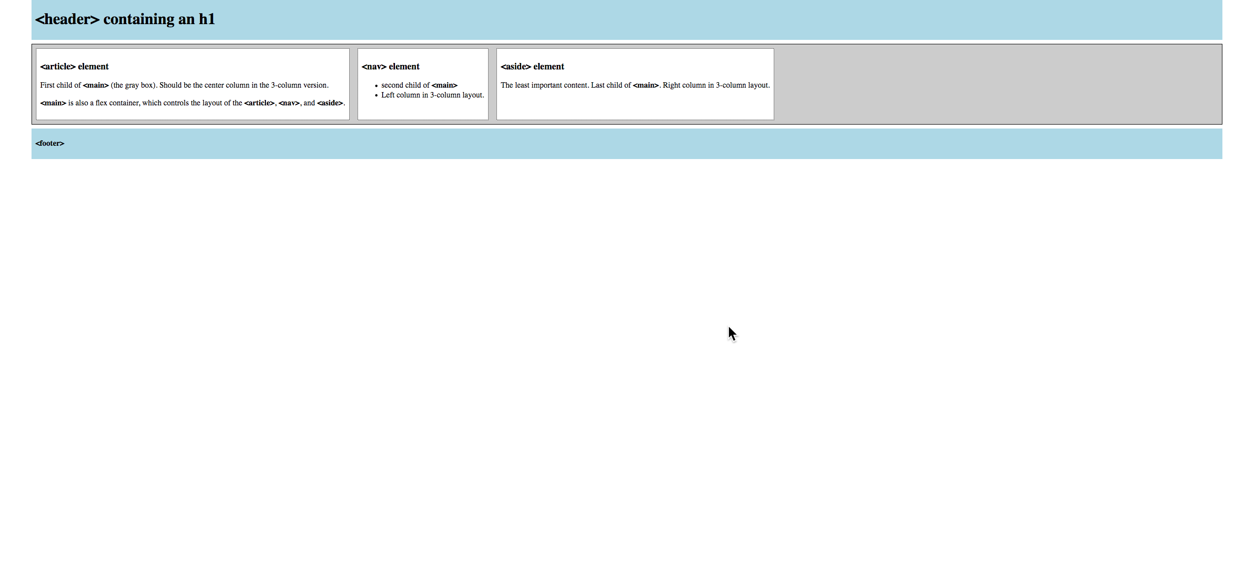
If you preview the page, however, you'll see that nothing's changed. That's because align-items doesn't work on the height of elements, even when it's a column-based flex container. We have to explicitly tell the main element that it should grow to fill the avaiable space.
In the style rules for main, add flex: 1 to allow the element to grow. Then preview the page again; it should look like this:
That's closer to what we want, but it's not quite done.
Formatting the Content Columns
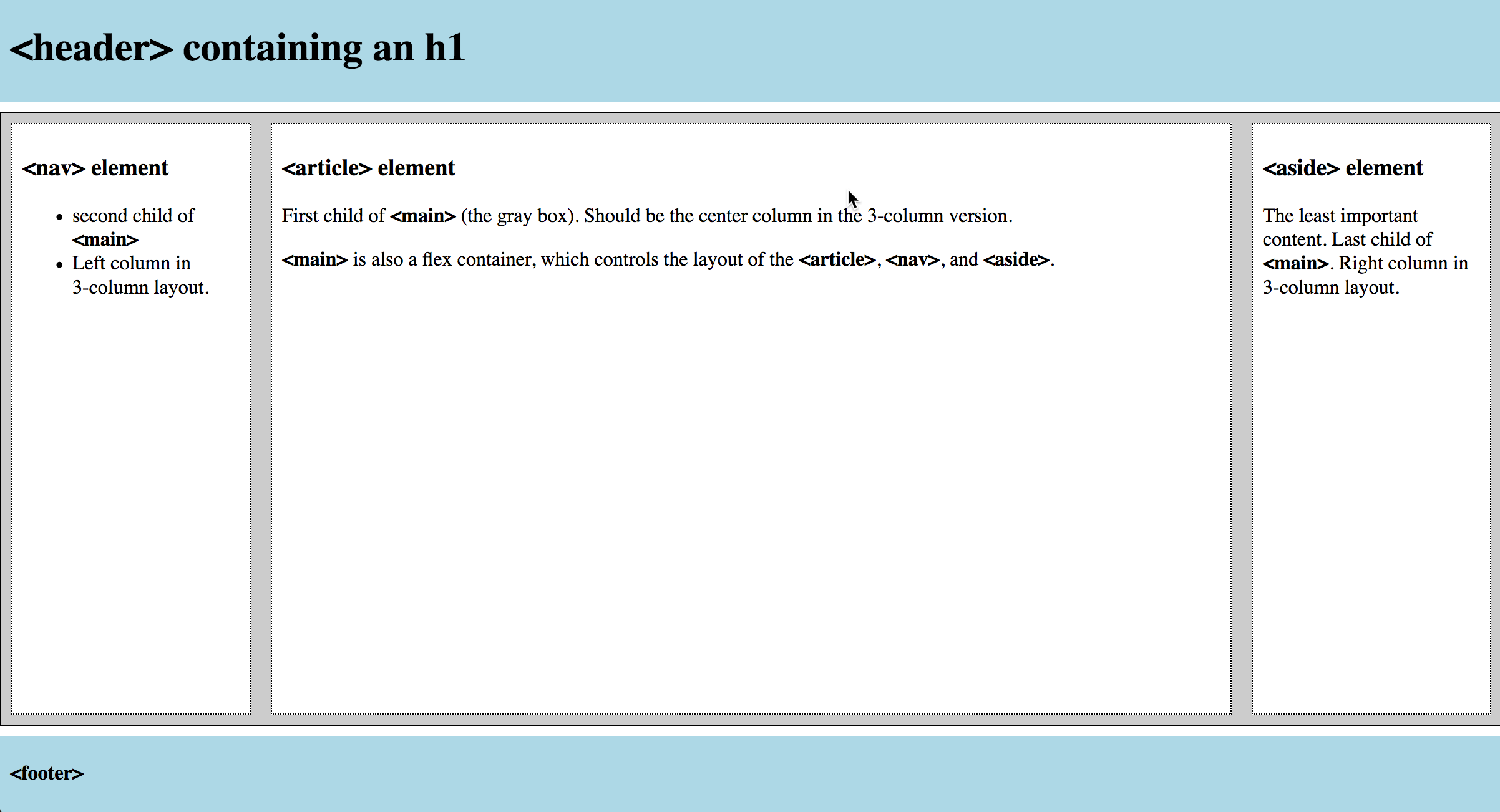
In a traditional Holy Grail layout, the article content is first in the source code, and displays in a variable width center column that stretches to fill available space. The two sidebars are fixed widths on either side.
To change the order of the columns, set order: -1 on the nav element. Since the default value is 0, this will force it to display first in the row.
To make the aside and nav elements a fixed width of 12rem (192px since our base font is 16px), give them this rule: flex: 0 0 12rem.
To make the article element grow to fit the available remaining space, assign this rule to it: flex: 1.
Preview the page; it should now look like this:
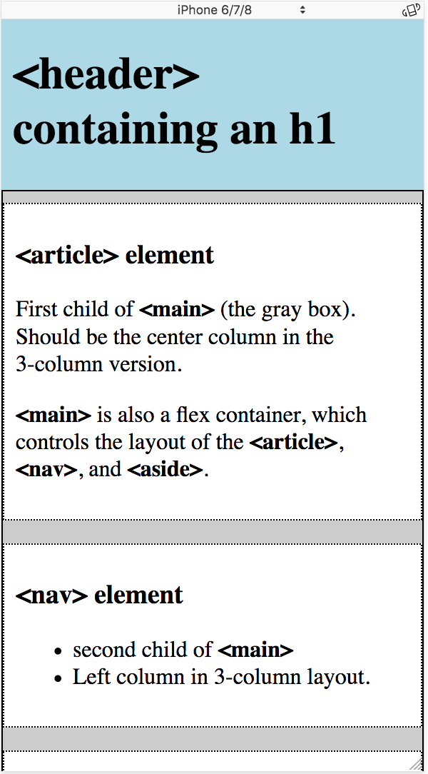
Graceful Degradation
Because the focus of this exercise was on implementing the Holy Grail layout, I didn't use a "progressive enhancement" approach of designing for mobile-first. Unfortunately, this layout breaks down in a problematic way on a small screen (try resizing the window to see what happens). We can add a media query to fix that.
At the end of your code, add a media query for viewports smaller than 36rems:
@media screen and (max-width: 36rem){ }
In the media query, change the flex-direction on main to be column rather than row (flex-direction: column;), and set its width to be 100vw rather than 95vw.
Assign max-width: none; to #wrapper, so that the content takes up the full width of the viewport.
Then apply the following rules to nav, aside, and article:
order: 0;/* resets order to source default */flex: 1;/* allows elements to grow to available space */margin: .5rem 0;/* removes l/r margin spacing */
When you resize your browser window, or choose a small screen in responsive mode, your page should look like this:
Submitting Your Work
When you're done, add a link to your landing page and push the files to GitHub. Files must be online by the beginning of class on Thursday, 10/4.